PROJECT NO.
Role
UI/UX, Visual Designer
Team
2 Designers, 1 Developer, 1 PM
Timeframe
Jan 2025 – Present
Tools
Figma, Adobe XD, Illustrator, JIRA, Microsoft Clarity
Website

Problem
HYTE’s original product detail page struggled with cluttered layouts, unclear hierarchy, and a long scroll that made it difficult for users to explore features or complete purchases. Important specs and CTAs were buried, and the overall experience failed to reflect the brand’s premium positioning.
What wasn't working:
Cluttered layouts buried key product information
Critical specs and CTAs were buried
Mobile experience had frequent mis-taps
No guidance for building compatible systems
Endless scrolling fatigued users

Research & Insights
We audited the old PDP, synthesized backend logs, Clarity heatmaps, and connected site analytics to map current PDP behavior. With limited time, we focused on the most critical problems affecting the users.

Clarity Heatmaps
70%
of users scrolled past the fold without engaging with product variants
Support Tickets
80%
of inquiries were about component compatibility and availability
Mobile Analytics
2.3x
higher mis-tap rate on mobile variant selections compared to desktop
Cart Abandonment
76%
of users abandoned cart due to uncertainty about product fit
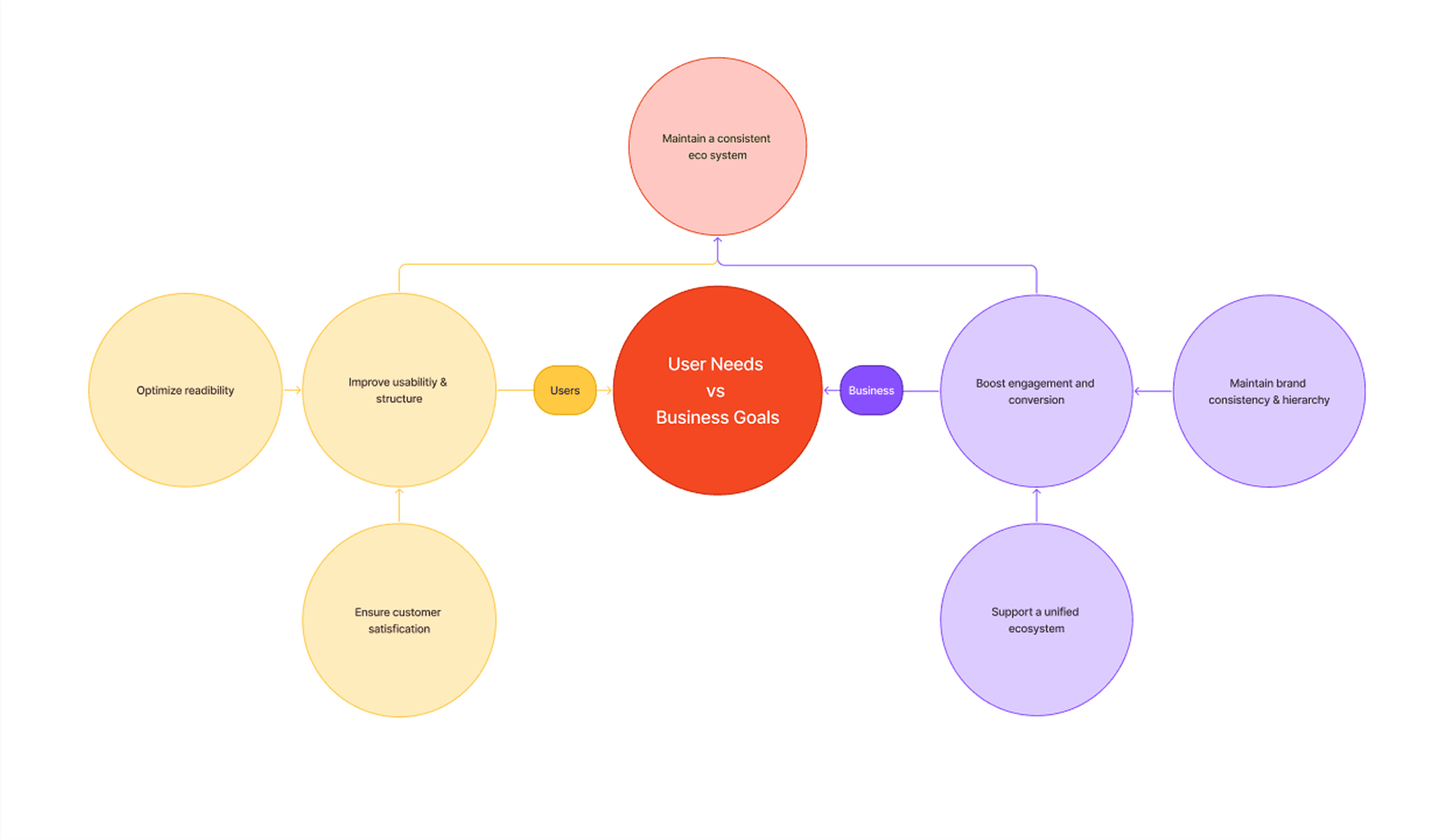
Objectives
Given the limited project time, we focused on the areas that would create the most impact for users and business by improving clarity, highlight product strengths, and streamline the shopping flow. Making it easier for users to configure and purchase, while ensuring the visuals aligned with HYTE’s design system and branding.
Build your own PC
Curate compatible components directly on PDP
Streamline Flow
Reduce screen friction and scroll fatigue
Ensure Consistency
Apply tokens/components for reliable interactions
Simplify Content
Consolidate details and keep the page on brand
Clarify Status
Show availability & shipping to reduce confusion/support load
Constraints & Decisions
We had to play inside a legacy CMS, so no from-scratch rebuilds or fancy new layouts. Brand rules stayed, and we kept AA contrast + page weight in check. The old page made people scroll forever (and mis-tap on mobile), and we only had eight weeks. So we went token-led, not from-scratch: reorder the top (title/price/variants/CTA), put trust info by the button, tighten the gallery, lock in variant states, and ship a sticky mobile CTA with real tap targets. Same system, smarter structure, faster to ship and easier to use.
Design Solutions
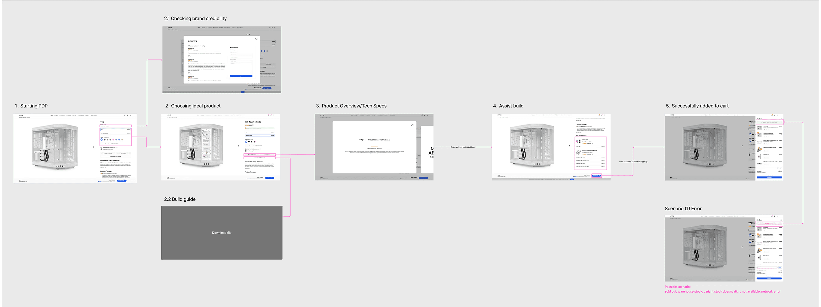
After narrowing down the collected data, I started drafting ideas and discussed with our remote team to share my POV on which one would ideally fit the above criteria to move forward with. Then I laid out a quick flow with the selected framework to check compatibility and make sure we were aligned with our goal.
*Old vs New Flowchart

*Drafting flowcharts & functionality

Visible hierarchy
We used an above-the-fold 70/30 split screen to surface what shoppers need first, title, price, variants, and CTA, so they can decide faster with fewer backtracks.
Before

After

Seamless storytelling
To reduce scroll fatigue, we moved long content into an on-demand modal: tap to read, close to return. It keeps the page light, the story's clear, and the sections well-separated.
Before

After
Guide users to build confidently
We added curated cross-sell + compatibility picks on the page so users can assemble their build without leaving the page or worrying about fit.
Before
Feature doesn't exist
After

Smooth shopping experience
We added an intuitive slide-in cart that gives instant, in-context added/error feedback, reassuring users without interrupting their purchase decision while staying on page.
Before

After

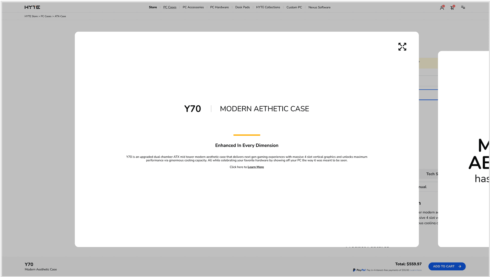
Increase credibility from start
We consolidated the review section and placed it to the top to establish trust early.
Before

After

Handoff & Post-staging QA
We prototyped both viewports and had a walkthrough meeting on how the features and flow work for our devs. I worked on possible scenarios and QA’d the flowchart to ensure a smooth handoff to our devs. (Excluded staging site for confidentiality purposes.)

Iterations
After our developer finalized the warehouse/inventory logic, we shipped the bundle feature. It was a quick turn, landed before post-staging QA, and now lives as a reusable component in our library, supporting attach and conversion.

Outcomes
Cart Add Rate
+20%
More visitors complete a purchase
Mobile Mis-taps
-45%
Improved touch target sizing and placement
Average Order Value
+62%
Cross-sell recommendations & bundles driving sales
Support Tickets
-34%
Better information architecture reducing confusion
Outcomes are being measured via ongoing A/B tests. We’re monitoring cart add rate, checkout starts, mis-taps on mobile variant picks, and support tickets. Initial signals point to improved hierarchy, reduced scrolling/backtracks, and a smoother add-to-cart flow. Below are the public V1.1 prototypes, test them out yourself!
Key Learnings
When I first looked at the PDP, I was thinking in screens. But users don’t buy screens, they buy certainty. Most people want three answers fast: Is this the right variant? Will it fit my build/setup? When will it arrive? Framing the work around those questions changed the decisions I made.
Because of time and tech limits, a full rebuild wasn’t smart, so we chose a token-led refactor instead. The wins showed up in small, practical ways. A big challenge became a growth point for me was empathizing with engineering and prototyping the details so we shared the same language. Building that understanding took compromise and time, and it helped us grow as a team.