PROJECT NO.
Role
UI/UX, Visual Designer
Team
1 Designer, 1 Developer, 1 PM
Timeframe
May 2024 – Present
Tools
Figma, Adobe XD, Illustrator, JIRA, Microsoft Clarity
Website
Design System
Style guide 2.0
What’s the problem?
HYTE’s design system wasn’t its own blueprint. It was patterned after MUI, which made it look complete but didn’t reflect the brand’s identity. About 80% of components had no defined usage, some essential ones were missing, and inflexible layouts created confusion and extra work during collaboration between designers and developers.
What can we do to make it better?
We revamped the design system to meet industry standards, establishing a comprehensive blueprint to improve development efficiency and brand consistency. The new system includes a component library, style guide, content guide, and documentation.

Competitor Analysis
Reviewed top gaming and tech brands to extract effective patterns, layouts, and brand approaches, then tailored them to HYTE’s identity and user needs.
Research Data
Audited HYTE’s products and, with stakeholders, identified inconsistent components, accessibility gaps, and inflexible layouts.
Aim
Strengthen the brand, improve usability, and streamline the design–dev workflow with a consistent, maintainable system.
How do we get started?
First of all, we created an extensive library from scratch to development process. To ensure smooth process and communication with our devs and achieve our goal for the design system.
Style Guide
• Breakpoints
• Typography
• Iconography
• Spacers
• Grids
• Divider
• Color
Components
• Buttons
• Forms
• Alerts
• Badges
• Cards
• Tickets
• Tabs & Menu
Content Guide
• Principles
• Restrictions
• Usage
• Definitions
Documentation
• Best practices
• Editorial guide
• Implementation guide
• Do’s & Don’ts
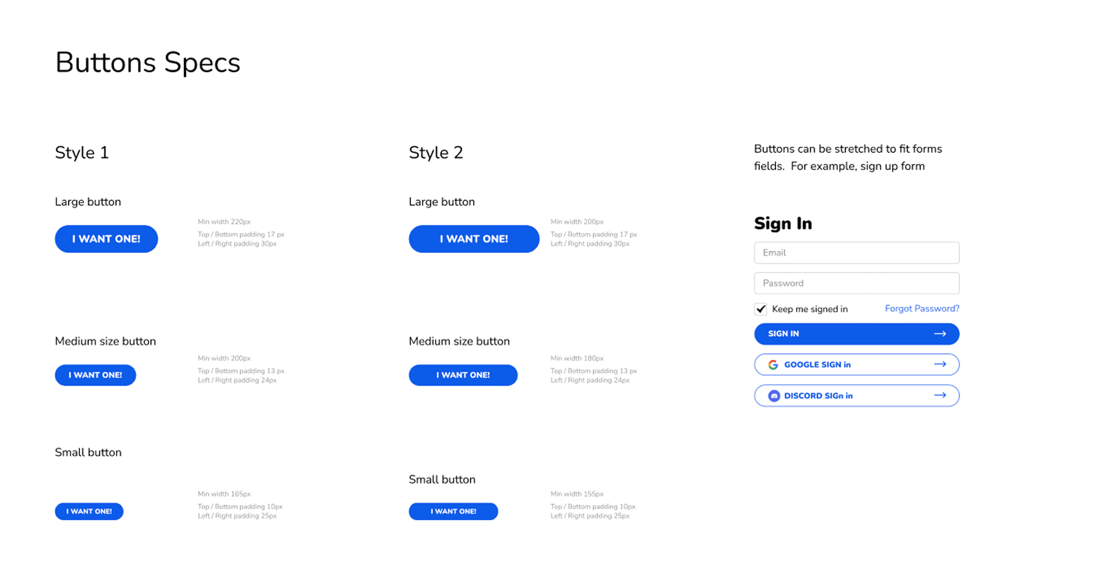
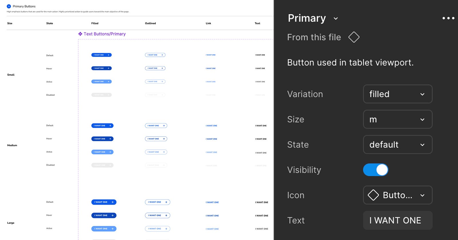
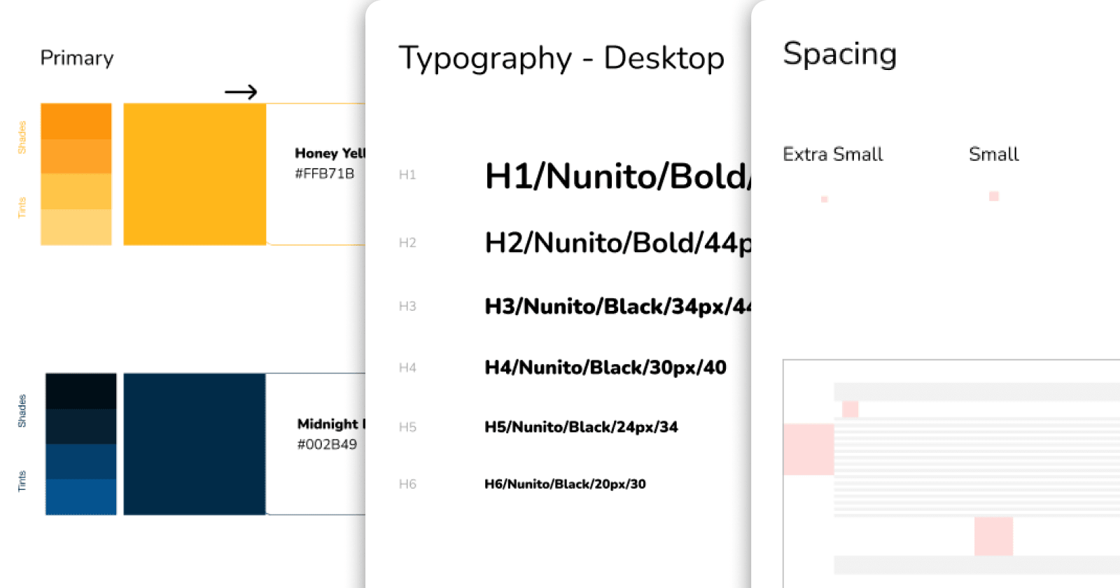
What does our design system contain?
We created 300+ components and 200+ tokens to support site functionality and visual hierarchy. Each component is curated to reflect the brand’s perspective and defined for use across likely scenarios. Here are a few sneak peeks from the system:

Color

Typography

Forms

Spacers

Buttons

Alerts

Tags

Cards
How does the design work?
We applied an atomic design approach to enable dynamic usage across pages with different template layouts, making builds faster with preset components for both designers and developers. Below is one example of how they’re composed together:
Atoms
Input Label
|
BUTTONS
Molecules
First Name
Enter your first name
Organisms
First Name
Enter your first name
Last Name
Enter your last name
Templates
Your Name
First Name
|
Last Name
Enter your last name
SAVE
CANCEL
Functionality & Features
Components
Before
The old version had limited styles, no states or guidelines, and every button was a parent component, making it heavy and slow to use.
• Limited styles and flexibility
• No states or usage guidelines
• Filled with parent-only structure
• Slow to locate components
After
Now, it is flexible and compact. Easy updates, clear states, guidelines. Parent-child setup for faster load & clear naming for quick finds.
• More flexibility, easier adjustments
• Defined states + usage guidelines
• Parent-child structure for efficiency
• Clear naming for faster search
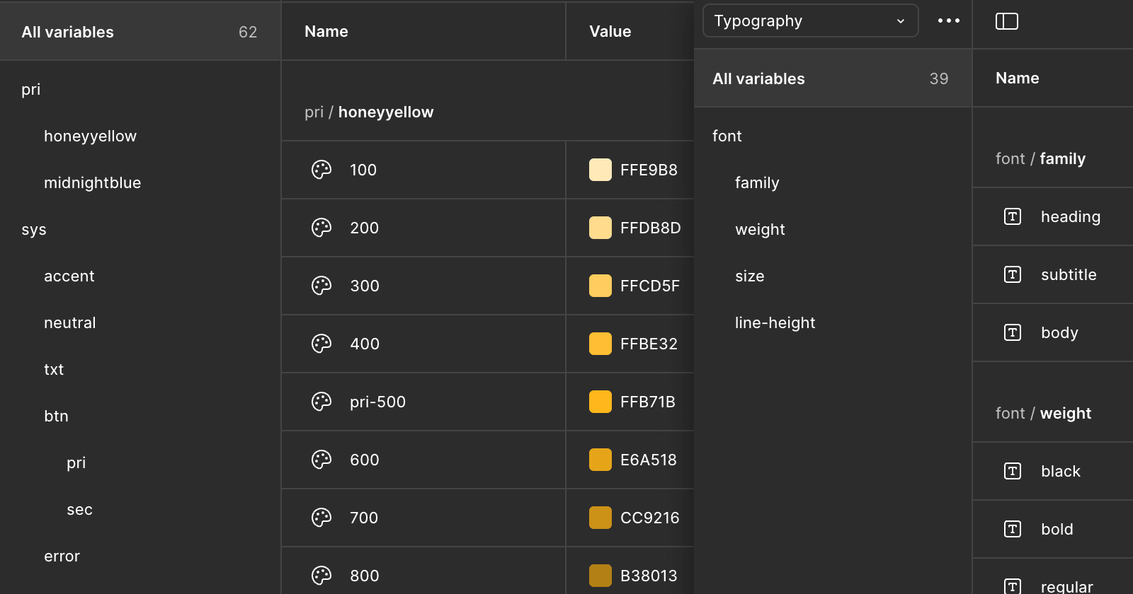
Variables & Tokens
Before
Conventions and usage were scattered around, making it slow to find the right info. Every change meant tedious updates.
• Scattered across multiple frames
• Time-consuming to locate infos
• Tedious updates for each element
After
Everything is organized into a single library with related categories grouped together, clearer naming, and faster syncing.
• Centralized library with related categories
• Clear definition for quick reference
• One update syncs across all frameworks
How is it applied?
Here is a snippet of the in-progress submission modal, showing how tokens, components, and content guidance work together.
What we achieved from the design system
Although it took more steps to set up, it was worth it. Now we’ve got seamless collaboration between designers and developers. It’s quicker to find what we need, everything stays in sync, and one update fixes it everywhere, no more digging through files.
• Quicker search and access to components
• Consistent naming and structure
• No more repetitive manual updates
• Smoother handoff between design and dev